
Introduction[1]
Since the beginning of time, colour has profoundly influenced the human race. The Psychology of Colour, building upon foundational work I penned years ago, delves into the diverse meanings of colour and its varied impact from one culture to another. Colours are deeply symbolic in many societies, often entwined with emotions, rituals, and broader political and social constructs. These perceptions are shaped by historical events, religious beliefs, geographical conditions, and societal norms, making the study of colour symbolism a rich facet of cultural studies.
This paper embarks on a multidisciplinary exploration, dissecting the psychological underpinnings of colour preferences and their subsequent effects on consumer behaviour. It examines the symbolic significance that colours carry in different societies, revealing how a single hue can embody celebration in one context and mourning in another. The paper underscores how these cultural nuances in colour perception influence marketing strategies and branding, advocating for a nuanced approach that can traverse global markets and resonate with a diverse audience.

Image Credit: An abstract representation that captures the use of colour in marketing. This image illustrates the dynamic and creative role of colors in engaging and communicating marketing messages. Drawn by DALL-E, a sub-set of ChatGPT, January 2024
Weaving through history, the paper highlights civilisations that have skilfully wielded colours to express identity and convey status. It charts the evolution of colour’s role from ancient times to modern-day marketing, emphasizing key contributions from pioneers in the field of colour psychology. The paper offers a synthesis of art, history, culture, and commerce to provide a comprehensive understanding of colour’s dynamic role in shaping consumer experiences.
In essence, The Psychology of Colour aims to equip marketers, designers, and scholars with an in-depth perspective on the strategic use of colour, emphasising its ability to engage and influence effectively. The key findings highlight the universal presence of colour in decision-making, the cultural specificity of colour symbolism, and the strategic importance of colour in establishing brand identity and consumer relationships.
Ultimately, the paper champions a conscientious and informed approach to applying colour—one that leverages its potential to forge a connection with the human spirit across cultures. This introduction serves as a prelude to a thorough analysis of colour’s multifaceted role in human culture and its far-reaching implications in consumer behaviour, setting the stage to provide actionable insights for contemporary applications.
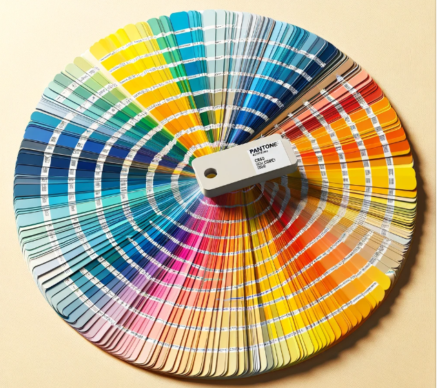
What is Colour?
In the realm of physics, colour as a concept does not exist independently; what exists are light waves of varying wavelengths, which the human eye perceives as colour. This perception arises from the interaction of light with the eye, leading to the differentiation of hues and tints. Colour, in essence, is a feature of visual perception categorised into names like red, blue, yellow, green, etc., and is derived from the stimulation of the eye’s cone cells by electromagnetic radiation within the visible spectrum.

Image Credit: A color swatch guide inspired by a Pantone-type fan deck, arranged in a circular fashion to display a spectrum of colors. Drawn by DALL-E, a sub-set of ChatGPT, January 2024
Fully understanding colour requires an appreciation of several key concepts:
- Wavelengths and Light: Colour is determined by how an object absorbs and reflects light’s varying wavelengths. The visible spectrum is composed of these colours, and the specific wavelengths that an object reflects rather than absorbs are what we see.
- The Colour Wheel: A circular diagram that organises colours based on their chromatic relationship. Primary colours—red, blue, and yellow—are spaced evenly around the wheel and can be mixed to produce secondary colours (green, orange, and purple), with further combinations yielding tertiary colours.
- Hue, Saturation, and Brightness: These represent the three fundamental attributes of colours. ‘Hue’ identifies the colour itself, ‘saturation’ describes the intensity or purity, and ‘brightness’ concerns the lightness or darkness of the colour.
- Colour Perception: Human perception of colour is subjective and influenced by various factors, such as lighting conditions, the environment, and cultural context. This means that the same colour may be seen differently by different observers or in different situations.
- Additive and Subtractive Colour Models: The additive model of colour mixing is used in lighting and digital screens, where red, green, and blue light combine in various ways to produce the full spectrum, including white. The subtractive model is used in pigments and dyes, such as in painting and printing, where cyan, magenta, and yellow pigments mix to filter out light and create the perception of other colours, including black.
- Psychological and Cultural Implications: Colours carry psychological weight, capable of evoking emotional responses or conveying symbolic messages. Cultural interpretations of colours vary significantly, with different societies ascribing different meanings to the same hues.

Colour is, therefore, a complex phenomenon that goes beyond mere physical properties and extends into the realms of perception, psychology, and culture, all of which matter as colours elicit different emotions and reactions from consumers.
Colour is often one of the first things that consumers notice about something and, therefore, a dominant factor in determining a customer’s first impression about a product or service.
Understanding colour’s intricate nature bridges the gap between its physical properties and its profound psychological and cultural influence. Such an understanding is pivotal in consumer interactions, as colour often forms one of the first impressions, significantly shaping a customer’s perception of a product or service. Dr Morton Walker, in his book The Power of Color[2], emphasises the immediacy and longevity of colour impressions, stating, ‘Marketing psychologists advise that a lasting color impression is made within ninety seconds and accounts for sixty per cent of the acceptance or rejection of an object, place, individual, or circumstance.‘ This underscores the strategic importance of colour choices in marketing, where a well-considered palette can be critical to commercial success.
What is The Psychology of Colour?
Colour psychology is the study of how colours affect perceptions and behaviours. In marketing and branding, it plays a crucial role as different colours can evoke different emotions and reactions in people[3], influencing their decision-making and attitudes.
The general model of colour psychology relies on six basic principles[4]:
- Colour can carry a specific meaning.
- Colour meaning is either based in learned meaning or biologically innate meaning.
- The perception of a colour causes evaluation automatically by the person perceiving it.
- The evaluation process forces colour-motivated behaviour.
- Colour usually exerts its influence automatically.
- Colour meaning and effect relate to context as well.[5]
This field of study examines the often subtle yet significant ways in which colour affects various aspects of life, such as the perceived taste of food. People’s reactions to colours can be emotional, and these reactions can vary based on factors like age, gender, and cultural background. While specific colour associations may differ across cultures, general colour preferences tend to be consistent across genders and ethnicities.
Undeniably, in the realm of marketing and branding, colour psychology plays a crucial role. Marketers recognise the power of colour in shaping consumers’ emotions and perceptions toward products and services. Company logos, for example, are crafted with colour considerations in mind, aiming to attract more customers through visually appealing designs.
The Impact of Colour in Therapeutic and Educational Settings
Shifting focus from marketing, it’s worth exploring the impact of colour in therapeutic and educational settings. The application of colour psychology spans diverse fields, including medical therapy, sports, hospital environments, and even game design. Carl Jung[6], a prominent figure in the early development of this field, emphasised the profound connection between colour and the subconscious, famously stating that “colours are the mother tongue of the subconscious.”

Image Credit: The image shows an ancient Egyptian room designed for color therapy, with Egyptian attendants and women caring for those needing therapy. The scene captures the therapeutic atmosphere with attendants in traditional attire tending to individuals in a colorfully illuminated environment, enriched with traditional Egyptian art and furnishings.
Drawn by DALL-E, a sub-set of ChatGPT, January 2024
Historically, the therapeutic use of colour dates back to ancient civilisations. The Egyptians, for instance, practised colour “cures,” using painted rooms or coloured light for healing. Similarly, ancient Chinese medical texts like the Huangdi Neolignane Ching document the use of colour in diagnostic and healing practices. But more about colour and ancient civilisation is covered later.
Johann Wolfgang von Goethe[7], a German poet and writer, made significant contributions to colour theory with his 1810 publication, Theory of Colours, where he attributed specific psychological qualities to different colours. Kurt Goldstein[8], a German neurologist and psychiatrist, later explored the physiological effects of colour, although some of his findings, such as the impact of red on motor function, were not substantiated in later research. Nonetheless, his work laid the groundwork for future studies in this field.
Carl Jung’s extensive work in colour psychology during the 20th century, particularly his exploration of colour’s symbolism and its role in art and psychotherapy, has been highly influential. He investigated colours across various cultures and historical periods, often using his patients’ mandalas[9] as a research tool. Jung’s interest in alchemy further enriched his understanding of colour symbolism, contributing significantly to the contemporary field of colour psychology.
Colour Psychology in Use
Some common ways colour psychology is used in marketing include:
- Brand Identity: Colours help in forming a brand’s identity. For example, red can evoke feelings of excitement and passion, while blue can convey trust and dependability.
- Product Packaging: colours on packaging can influence buying decisions. Bright and bold colours might attract attention, while softer hues might convey luxury or simplicity.
- Website and Ad Design: The choice of colours in digital marketing can affect how users interact with a website or view an ad. For example, green is often used to promote environmental products, suggesting nature and sustainability.
- Target Audience: Different colours can appeal to different demographic groups. For instance, children might be more attracted to bright, primary colours, while adults might prefer more subdued tones.
- Emotional Appeal: Colours can be used to create an emotional connection with the audience. Warm colours might develop a sense of warmth and comfort, while cool colours can be calming and professional.
- Cultural Context: The meaning of colours can vary across cultures, so understanding the cultural context is important in international marketing.
Colour psychology in marketing is about using colours strategically to communicate a desired message, evoke specific emotions, and influence consumer behaviour. Our moods and physical responses are affected by colours, and our perceptions as customers are influenced by the following:
- Two colour hues (warm and cool).
- Degrees of colour saturation (refers to the amount of grey in a colour and determines how vivid it is).
- Luminosity refers to the whiteness or intensity of a colour; luminosity for any one colour will range from pure white through to black.
- Levels of depth (light or dark).
Beyond marketing, colour psychology plays a significant role in therapeutic settings and other industries. In colour therapy or chromotherapy, colours are used to heal physical or mental health by balancing the body’s energy centres or chakras[10]. For instance:
- Blue light therapy is often used to treat seasonal affective disorder (SAD) and certain skin conditions.
- In interior design, colour choices are crucial for creating environments that can influence mood and behaviour.
- Calming colours like green and blue are often used in hospitals to create a peaceful atmosphere.
- In education, vibrant colours are employed in classrooms to stimulate learning and creativity, especially among younger children.
We all know that colour can affect our moods. For example, we find that some colours are uplifting and inspiring, and others are depressing. We often use terms such as “feeling blue,” yellow-bellied,” “green with envy,” and “seeing red” without even thinking about the words we use to give the meaning we intend.
Examples and Case Studies in Marketing and Branding
- A notable example of colour psychology in branding is the use of red by Coca-Cola. Red, associated with excitement and energy, aligns perfectly with the brand’s dynamic and lively image.
- Another example is the use of green by Starbucks. Green evokes feelings of relaxation and tranquillity, aligning with the comfortable and inviting ambiance that Starbucks aims to offer its customers.
- Additionally, Apple’s use of white in branding and product design conveys simplicity, purity, and elegance, which aligns with the company’s focus on clean, minimalist design.
Research in psychology suggests that warm colours (red, orange, and yellow) generally encourage activity and excitement, whereas cool colours (green, blue, violet) are more soothing and relaxing. That’s why so many soaps, lotions, body washes, and other toiletry potions come in packages with cool colours; they’re trying to paint a calming picture of their product. It’s also why children’s toys and sweets are often sold in the warm colours – they are trying to encourage notions of fun and energy.
Remember that there are no “good” or “bad” colours. All colours have positive and negative effects depending on context.
Colour psychology is a powerful tool in understanding human behaviour and perception. Its applications span various domains, and its influence is seen from historical healing practices to modern marketing strategies. The study of colour psychology continues to evolve, offering deeper insights into how colours affect our daily lives.
Examples of Colour in Use
- Red in China is a colour for joyous and festive occasions, whereas, in Japan, it is used to signify anger and danger.
- Blue for the Cherokee Indian signifies defeat, but for the Egyptian, it signifies virtue and truth, while yellow signifies happiness and prosperity.
- In the Japanese theatre, blue is the colour for villains or other malfeasants.
- White is the colour of death in Chinese culture, but purple represents death in Brazil.
- Yellow is considered sacred to the Chinese but signifies sadness in Greece and jealousy in France.
- In North America, green is typically associated with jealousy.
- People from tropical countries respond most favourably to warm colours, whereas people from northern climates generally prefer cooler colours.
Limitations
While colour psychology provides valuable insights, it’s important to acknowledge its limitations. One of the primary challenges is the subjective nature of colour perception. Individuals may have personal associations with colours based on their experiences, making it difficult to generalise findings. Additionally, cultural differences play a significant role in colour interpretation, which can vary widely across societies. There is also a lack of standardised methodology in colour psychology research, leading to inconsistent and sometimes contradictory findings. Marketers and therapists must remember these limitations and use colour psychology as one of many tools in their arsenal rather than a definitive solution.
The Embodied and Referential Theory of Colour
The embodied and referential theory of colour is a fascinating aspect of colour psychology, particularly in the context of consumer behaviour and preferences. This theory suggests that colour can convey two distinct types of meaning: embodied meaning and referential meaning. Understanding both meanings helps in comprehending how colour influences consumer behaviour and decision-making.
Embodied Meaning
- Definition: Embodied meaning refers to the innate, physiological responses we have to colours. These responses are often universal and biologically ingrained, stemming from our evolutionary history. For instance, the colour red can increase heart rate and create a sense of urgency. This response is thought to be an evolutionary reaction, as red is often associated with danger or alert in nature.
- Application in Marketing: In marketing, this concept is used to elicit immediate, almost instinctive reactions. A brand might use red to create a sense of excitement or urgency, like in clearance sales or fast-food logos.
Referential Meaning
- Definition: Referential meaning involves the symbolic associations or references that a colour holds. These meanings are learned and can vary widely across different cultures and individual experiences. For instance, green often symbolises nature and environmental friendliness in many cultures. However, in some Eastern cultures, it can have negative connotations, such as illness.
- Application in Marketing: Brands often use referential meanings to connect with specific cultural or emotional themes. An eco-friendly product might use green in its branding to highlight its connection to nature.
Status/Position in Relation to Colour Psychology
- A Subset of Colour Psychology: The embodied and referential theory is a subset of colour psychology. While colour psychology broadly studies the impact of colour on human behaviour and emotions, this theory specifically focuses on how these colours convey meanings and influence consumer behaviour.
- Interdisciplinary Nature: This theory is inherently interdisciplinary, combining insights from psychology, neuroscience, cultural studies, and marketing.
- Importance in Consumer Research: In consumer research, this theory is particularly significant. It helps marketers understand how to use colour to communicate with their audience effectively, aligning the colour choices with the intended message and the target audience’s cultural background.
- Evolving Understanding: The understanding of embodied and referential meanings of colour is continually evolving. As research progresses, our comprehension of how colour affects human psychology and consumer behaviour becomes more nuanced.
The embodied and referential theory of colour plays a crucial role in colour psychology, especially concerning consumer behaviour. It provides a framework for understanding how colour meanings are not just a matter of innate biological reactions but also involve complex cultural and symbolic associations. This theory is essential for anyone in the field of marketing, branding, or consumer research, offering a deeper insight into how colours can be strategically used to influence consumer preferences and behaviours.
How it Started
The use of colours in human civilisation didn’t happen yesterday but dates back to ancient times, and it’s challenging to pinpoint a single civilisation as the first to use colours. Various ancient cultures used colours for a variety of purposes, including art, symbolism, and practicality. Here are a few examples:

Image Credit: The image depicts an ancient Chinese room designed with Feng Shui principles and the Five Elements theory in mind. It shows traditional Chinese furnishings and decorations in colors associated with wood, fire, earth, metal, and water to create harmony and balance.
Drawn by DALL-E, a sub-set of ChatGPT, January 2024
- Ancient Chinese: Chinese culture has a long history of using colours symbolically. The Five Elements theory in Chinese philosophy associates specific colours with different natural elements (wood, fire, earth, metal, and water), which influenced art, architecture, and even traditional medicine. Traditional Chinese culture has a rich history of associating colours with various elements and principles. The concept of “Feng Shui” incorporates colour symbolism to balance energies and create harmony in living spaces.
- Ancient Greeks: In ancient Greece, colours played a significant role in art, fashion, and symbolism. Greek pottery, for example, featured intricate designs with colourful patterns and motifs. Different colours were associated with gods, emotions, and societal roles. Colour symbolism was integral to their art and mythology. Colours like white, red, and black were associated with different gods, and they often used colour to convey emotions and themes in their plays and art.
- Ancient Egyptians: The ancient Egyptians are known for their extensive use of colours in art and daily life. They used vibrant pigments made from natural materials to create colourful murals, sculptures, and pottery. Colours held symbolic meanings in Egyptian culture, and they were often used in religious and funerary contexts. They associated different colours with specific deities, emotions, and concepts. For example, the colour green was associated with fertility and rebirth due to the lush vegetation along the Nile River.
- Indigenous Cultures: Many indigenous cultures around the world have used colours in their traditional clothing, body paint, and artwork for centuries. These colours often carry cultural and spiritual significance, and they are used to express identity and heritage.
The reasons for using colours in ancient civilisations varied widely. They used colours for artistic expression, to convey cultural and religious symbolism, to differentiate social classes, and even for practical purposes such as clothing and shelter. Colours often carried specific meanings and conveyed emotions, and their use evolved over time within each culture. It is a multifaceted phenomenon with a rich history that encompasses artistic, cultural, religious, and practical aspects. Different civilisations developed their unique colour traditions, and these traditions have left a lasting impact on the way we understand and use colours today.
The idea that colour affects human responses is not a recent development but has ancient origins. Over time, this understanding has evolved and been further explored through modern research and marketing practices. The way consumers respond to colour in marketing and advertising has its roots in various fields, including psychology, design, and marketing research. Here’s a brief overview of how this concept evolved:
Psychology
The relationship between colour and human psychology has been studied for many years. Pioneers in this field, such as Wilhelm Wundt and Carl Jung, explored the psychological and emotional impact of colours on individuals. For example, they noted that certain colours could evoke specific emotions or moods.[11]
The concept of colour psychology gained prominence as researchers delved deeper into how different colours could evoke specific emotions and associations. For example, red might be associated with energy and passion, while blue might convey trust and calmness.
Design
In the early 20th century, design movements like the Bauhaus and the De Stijl group[12] emphasised the importance of colour in art and design. These movements promoted the idea that colours could convey meaning and create visual harmony or contrast.
Market Research
In the mid-20th century, marketing researchers and advertisers started conducting studies to understand how colour choices in branding and advertising could influence consumer behaviour. These studies often involved experiments and surveys to determine the impact of colour on consumer preferences and purchase decisions.
Branding and Logos
Companies and brands began to recognise the importance of colour in establishing brand identity and recognition. Iconic logos like Coca-Cola’s red and McDonald’s golden arches showcase how colour can become synonymous with a brand.
Cultural Context
Researchers also discovered that the impact of colour can vary across different cultures and regions, leading to the development of cross-cultural colour psychology.
Influence of Colour on Perception and Behaviour
Colour significantly influences human perception and behaviour, as evidenced by extensive research:
- Evolutionary Aspect: Studies suggest that primate trichromatic vision[13] evolved to better perceive emotions and physical conditions, aiding in complex social interactions. For example, changes in skin tone can indicate excitement or illness.
- Taste Perception: Colour affects how we perceive the taste and edibility of food and drink. Packaging colour and context influence these perceptions. For instance, bread in golden-brown packaging suggests freshness and drink colour can alter our expectations of its flavour.
- Perception of Time: Research shows that colour can affect time perception. Red has been found to make time seem longer than blue. This effect varies between individuals, with some studies showing contrasting results.
- Light and Colour Interaction: The colour of light sources changes the appearance of objects and can impact our perception of their shape, motion, and positioning. Uniform lighting helps in better perception of objects’ three-dimensional shape.
- Blue Light Effects: Blue light is associated with relaxation. Its usage in streetlights and train stations has been linked to reduced suicide rates and crime, although these effects are subject to debate.
- Medicinal Applications: The colour of pills can affect their perceived effectiveness, with ‘hot’ colours seen as stimulants and ‘cool’ colours as depressants. This phenomenon is more related to cultural associations than the colours themselves.
- Colour Preference and Emotion: Individual colour preferences vary, influenced by associations with the environment, cultural factors, and ambient temperature. For instance, blue and green are generally preferred due to their links with beneficial habitats.
- Ecological Valence Theory: This theory proposes that colour preferences arise from personal associations with the colour in the environment. For example, liking blue due to its association with clean water.
- Marketing Applications: Colour is crucial in product design and brand recognition. It conveys brand personality and can influence consumer behaviour. However, responses to colour are subjective and influenced by cultural, environmental, and personal factors.
- Brand Meaning and Logo Design: Colours in logos influence consumer perception. For example, specific colours are associated with particular brand traits. The appropriateness of a colour in a logo can depend on the product’s function and the intended market audience.
In summary, colour’s impact on human perception and behaviour is multifaceted, affecting various domains from marketing to medicine. While its influence is significant, it is also subject to individual, cultural, and contextual variations.
The idea that colours can influence consumer responses is a result of the convergence of insights from psychology, design, and marketing. It’s now a fundamental aspect of branding and marketing strategy, with businesses carefully selecting colours to convey specific messages and evoke desired emotions in their target audience.
Movers and Shakers
Colour marketing as a field does not have a single individual who can be definitively labelled as its “father” or “founder.” Instead, it has evolved through the contributions of various psychologists, designers, and marketers. Several individuals have played significant roles in advancing the understanding of colour in marketing and branding. Here are a few movers and shakers that have influenced the use use of colour in marketing to consumers:
- Faber Birren, an American colour consultant and author, made significant contributions to the field of colour psychology. He wrote several influential books on colour, including “Color Psychology and Color Therapy.” While not solely focused on marketing, his work laid the foundation for understanding the psychological impact of colour in various contexts.
- Herbert A. Millington was a marketing researcher who conducted pioneering studies on colour’s impact on consumer behaviour. His research in the mid-20th century contributed to the understanding of how colour choices in advertising and product packaging influence consumer preferences.
- Eva Heller, a German author and psychologist, is known for her book Psychologie de la couleur: Effets et symboliques (Psychology of Color: Effects and Symbolism). Her work delves into the psychological and cultural aspects of colour, shedding light on how colour choices can affect marketing and design.
- Pantone: While not an individual, Pantone, a company specialising in colour management and matching systems, has had a significant influence on colour in design and marketing. They developed the Pantone Matching System (PMS), a standardised colour system widely used in design and branding, making it easier for businesses to select and reproduce specific colours accurately.
Marketing with Colour
Although there are no hard and fast rules about colours in marketing, there are some things that seem to work well, time and time again.
Grey and blue corporate colours would be completely out of place for a fashion boutique. But these colours would be spot on for a financial services company, which must project permanence, stability and responsibility.
Using colours in marketing is a powerful way to set emotion, which is the real driving force behind decision-making. The simple fact is this: “Colour sells, but the right colour sells better”.
When choosing colours for your design, packaging or message, remember the rules for mixing colours. The human eye cannot focus on red and blue at the same time. You should never use blue type on a red background (even worse is using red type on a blue background). If you do so, you will lose your audience since mixing colours like this causes extreme eye fatigue.
Colour can have a great effect on whether or not your customer likes your product. In fact, some marketers use experts to help forecast which colours consumers will like two or three years down the road.
Colours mean different things to different people
Colours often have different symbolic meanings in different cultures.
- For example, white is the colour for weddings in western societies but for funerals in traditional Chinese culture; red is associated with rage in America but with happiness in China.
- In the US and many European countries, in fashion and decoration, blue is for boys while pink is for girls, which is a symbolic use of colour not shared by many other cultures.
General Principles
Colour is a very interesting phenomenon to which some general principles apply:
- Warm colours, like red, orange and yellow, tend to stimulate, energise and activate, whereas cool colours, like blue and violet, relax, soothe, and calm us.
- Green, because it is a combination of yellow and blue, can belong to either category, depending on the shade and tint.
- In general, darker tones make objects look smaller, while lighter tones make things look bigger.
- Colour is also affected by light. For example, in north facing rooms colours become cooler, and incandescent artificial lighting gives everything a yellow, warm tinge.
Source: Originally at Handbag.com
Researchers have found differences among social classes in colour preference:
- Hot, bright colours usually appeal to lower-end markets;
- Deep, rich colours have historically appealed to higher-end markets.
The good news is that most colours go well together with members of the same ‘family’:
- Warm colours of type, such as red, brown, orange, and yellow, look better together when combined with warm-coloured backgrounds;
- Cool-coloured types, like blue, green, grey, and potentially white, work well with cool-coloured backgrounds;
- Using colour families generally makes for a more appealing presentation, especially for large amounts of information.
Colour Influences
Using colour influences the mood and emotions of customers. The colours for type, illustrations and backgrounds influence the way they are perceived. Be careful with colours, as using too many lessens the impact of each colour and confuses your audience.
Colour plays a pivotal role in marketing and branding, as it can significantly impact customer perception and behaviour. The choice of colours for text, illustrations, and backgrounds can evoke specific moods and emotions, thereby influencing how customers perceive and interact with a brand or product. Each colour has its own psychological associations.
When designing marketing materials or branding elements, it’s crucial to consider the target audience and the message you want to convey. For instance, vibrant and energetic colours might appeal to a younger demographic, while more subdued tones could resonate with a mature audience. Moreover, the cultural context should also be considered, as colour meanings can vary significantly across different cultures.
It’s important to maintain a balance in the use of colours. As suggested above, overloading a design with too many colours can dilute the impact of each colour and lead to a confusing visual experience for the audience. A cluttered colour palette can distract from the core message and may even lead to negative perceptions of the brand. On the other hand, a well-thought-out colour scheme can create a strong visual hierarchy, guide the viewer’s attention to key elements, and make communication more effective. Thus, the strategic use of colour in marketing can play a significant role in conveying brand values, evoking desired emotional responses, and ultimately influencing consumer behaviour. A thoughtful approach to colour selection, considering both psychological impact and visual aesthetics, can enhance brand recognition and the effectiveness of marketing efforts.

The Basics
The table to the right provides a basic guide to using colour in marketing presentations to consumers. You should be aware of the positive and negative connotations of colours and the emotional response certain colours may evoke.
A Detailed Guide
WHITE
White is seen as representing freshness, cleanliness, purity and simplicity. Doctors and nurses wear white to imply sterility. Brides wear white to symbolise innocence and purity. White reflects light and is considered a summer colour. White is popular in decorating and fashion simply because it is light, neutral, and goes with everything.
On the other hand, white shows dirt and is much harder to keep clean than other colours.
White is often the colour of choice for bridal shops, religious groups, daycare centres, medical and dental facilities, caterers, bakeries, museums, and dry cleaners.
A few words of caution: white is a colour of death and mourning in China, Japan, and in some Middle Eastern countries.
PASTELS
If you want your message to seem fun, use a pastel colour. Make sure your copy shows up well on the paper.
BLACK
Black is dramatic, classy and serious. It suggests authority, power, boldness, seriousness and is distinguishing and classic. It represents formality, mourning, wealth, elegance, seriousness, distinctiveness, boldness, sombreness, authority and practicality. It is also a trendy colour that keeps consumers up to date with technology.
- Black is the colour of authority and power. It is popular in fashion simply because it makes people seem to be thinner than they really are. It is also stylish and timeless.
- Black also implies submission. Priests wear black to signify submission to God. Some fashion experts say a woman wearing black implies submission to men. Black outfits can also be overpowering or make the wearer seem aloof or evil. Villains, such as Dracula, often wear black.
- Black symbolises power, prestige, elegance, style, reliability, simplicity, and sophistication.
- In the past, black was viewed as the colour of death, witches, demons and evil.
- Black is a good colour choice for music shops, accountants, lawyers, computer stores, and tyre/motor spare shops.
GREY
- Grey is businesslike and distinctive, yet it can be seen as cold and sometimes uninviting.
- The cold influence of grey keeps it foreign, remote and distant.
- People who relate to the colour grey are often those who are careful and articulate and who are focused and dedicated to their commitments.
BLUE
- Blue represents comfort, loyalty, security, authority, dignity, faithfulness, trust, reliability, belonging, and coolness.
- Blue, the colour of the sky, is one of the most popular colours. It causes the opposite reaction as red.
Blue has long been associated with Europe’s royalty. Today, it works well to show power, authority, or prestige. It makes people feel calm, relaxed, tranquil, peaceful, wise, loyal, and trustworthy – it also helps people resolve their problems.
Strangely, the colour blue also helps increase productivity – it has been shown that people are more productive at work in blue rooms and that weightlifters are able to handle heavier weights in blue gyms.
On the other hand, the colour blue can also symbolise sadness, coldness and depression. Since most foods are not blue, the colour blue is known as an appetite suppressant that can help people lose weight!
Blue is a good colour choice for travel agencies, pool companies, masseurs, health centres, chemists, motels and psychologists.
Got the Blues?
Deep blues mean being analytical, serious, scholarly, academic, and even regal.
Pale blues mean calmness, peace, ethereal, fresh, clean and cool.
Blue works well across the sexes and is the most popular colour of both men and women. Several well-known companies (such as IBM) use blue in their logos.
Fashion consultants recommend wearing blue to job interviews because it symbolises loyalty.
BROWN
Brown relates to nature and things that are aged and even eccentric as well as sombre, natural, authentic, utility, earthiness, woodiness and subtle richness. Brown is solid and reliable and helps to create a neutral, comfortable and open atmosphere. It communicates credibility, solidity, strength and maturity.
Brown symbolises coffee, timber, and earth-tone products. It is a reliable, solid, strong, mature, and comfortable colour.
Brown, sensual in nature, has an important connection with home life and family – it symbolises physical comfort, ease and contentment. Light brown implies genuineness, while dark brown is similar to wood or leather. Men are more likely to say that brown is one of their favourite colours.
The colour brown is an excellent colour for ironmongery stores, coffee shops, craft shops, herbal shops, health food stores, male haberdasheries, furniture shops, western stores, contractors, clock shops, and carpenters.
GREEN
The colour green is symbolised with money, life, health, food, nature, youth, the environment, motion, mobility, wealth, nature, tranquillity, renewal, hope and freshness.
Dark green is masculine, conservative, and implies wealth. It is the colour of life and represents freshness, security and tranquillity whilst creating an atmosphere that is calm and restful and characterises the intense power of nature. Interestingly, light green calms people, which is why most walls in prisons, schools, waiting rooms and hospitals are light green.
Many companies feel green makes their prospects think about money. A green border with a graphic of a stack of pound coins works well for business opportunities. It works well for health too – green is a colour that soothes people, reduces pain, and makes us feel safe and welcome. This is a great quality for any product or service. A word of caution – yellow-green is not a good colour for food advertisements because it is an appetite depressant.
Green is a good colour for financial advisors, banks, and accountants because it signifies money. It is also good for outdoor products and sports because it gives consumers a natural outdoor feeling. Green can be used for greenhouses, landscaping, and farmers because of its connection with life and growth.
ORANGE
Orange implies warmth, excitement, and energy as well as being cautious, hazardous, energetic, fun, cheerfulness, vibrancy and warm exuberance. Orange has a declassifying, broad appeal and can be used to indicate that a product is suitable for everyone and can make an expensive product seem more affordable. Little wonder that the mobile phone operator Orange chose this colour to relate to its target audience.
The colour orange can help make an expensive product seem more reasonably priced. It is the perfect colour for products that appeal to a wide variety of people.
Orange is an appetite stimulant. It is a good colour choice for vitamin shops, Mexican restaurants, dance studios and products that target Latin and French people.
PINK
Pink means being healthy, childlike, feminine, innocent, soft and healthy. Pink is the most romantic and tender colour, and it is also tranquilising. Research suggests that pink makes people calm and soft-hearted.
Universally representing romance, caring and sharing, pink indicates a strong personality. Marketers know that affectionate and concerned people prefer pink.
PURPLE
Purple is a sophisticated, creative, luxurious, and wealthy colour. Purple is linked to royalty, sophistication and religion, as well as spirituality, dignity, sophistication, luxury, wealth, sophistication, costliness and mystery.
Many people love purple. For some reason, it is a favourite among children, and many of us never get over it when growing up – a good example of this is the purple used in Cadbury’s chocolate wrappers.
A bluish shade of purple tends to create mystery, while a reddish shade of purple is sensual and creative. Purple with a red tint will get more attention.
Purple is a great colour for elaborate restaurants, clothing stores, bookshops, art galleries, nightclubs, photographers, country clubs, golf courses, jewellery shops, beauticians, and even fortune tellers.
RED
Red is a highly visible colour that will always attract attention and also stimulate several emotions. It is the single most dynamic and passionate colour and symbolises love, rage and courage. Demanding attention, red has a great emotional impact.
Red is a colour associated with being aggressive, strong, heavy, assertive, and intense, as well as connecting with vitality, life-sustaining, passion, courage and insight. It symbolises action, warmth, power, aggression, excitement, drama, fire, blood, passion, love, danger, anger, and heat.
In written communications, red makes a message seem urgent or even aggressive.
Red is an attention grabber. Words and objects in red get people’s attention immediately. In decorating and design, red items are perfect since they attract attention. When it comes to cars, there is a positive correlation between the colour red and the rate of theft.
Apparently, gamblers spend more money in casinos decked in red than in casinos with any other colour. Red is a good colour for car sales, pet shops and pizza/spaghetti restaurants.
However, the colour red is not recommended for medical companies because it signals bad health, blood, and emergencies. Red is also the colour that accountants use to show negative figures.
YELLOW
Yellow represents caution, springtime and brightness. Other words associated with yellow are tropical, healing, illumination, discovery, sunshine and, at the opposite end of the spectrum, cowardice. Yellow exudes warmth, inspiration and vitality, and is the happiest of all colours. Yellow signifies communication, enlightenment, sunlight and spirituality.
Whilst yellow gets attention, because it is bright, it is hard on the eyes. Lemon yellow is the most eye-fatiguing colour – light is reflected by this bright colour, resulting in excessive stimulation of the eyes causing eye irritation.
It’s good to use some yellow in your marketing or on your packaging, but not too much of it.
Yellow is the first colour the eye processes. It is also the most visible colour to the human eye. This is why it gets attention faster than any other colour. But yellow is also used as a colour of caution.
Tests have shown that while yellow is considered to be an optimistic colour, people lose their tempers more often in yellow rooms, and babies will cry more.
Yellow is an excellent colour for sunny, happy, bright, cheerful, playful, easygoing, and optimistic advertisements. It’s ideal for florists, sweet shops, toy stores, amusement parks, and discount stores.
TEAL
Cool and constant, teal indicates stability and resistance to change. If teal is your favourite colour, you are a sensitive individual and have excellent taste. Optimistic and trusting, you have a high degree of faith and hope, easily trusting others.
VIOLET
Violet, the colour of luxury, indicates sensuality, passion and depth of feeling.
This lavish colour creates an unusual atmosphere and provides an unexpected essence. People who like violet tend to be unique, highly sensitive and observant. Creative and artistically talented, violet lovers tend to have complex personalities.

Citation/Credit: Plutchik’s wheel of emotions. Robert Plutchik. (2023, November 8).
In Wikipedia. https://en.wikipedia.org/wiki/Robert_Plutchik
Attribution: Machine Elf 1735, Public domain, via Wikimedia Commons
Challenges and Considerations in Colour Psychology
In delving deeper into the psychology of colour, it’s essential to acknowledge and address several challenges and ethical considerations. Two of the most important matters are:
- Colour Blindness: A crucial consideration is the prevalence of colour blindness, which affects approximately 1 in 12 men and 1 in 200 women globally. Design and marketing strategies must account for this, ensuring that information and aesthetics are accessible to all. This involves choosing colour palettes that are distinguishable even when colour vision is impaired and relying on more than just colour to convey critical messages.
Colour blindness, particularly red-green colour blindness, is relatively common, especially in men (see statistics above). This difference is due to the fact that the genes responsible for the most common forms of colour blindness are located on the X chromosome; since males have only one X chromosome, a single defective gene is enough to cause colour blindness. Females, having two X chromosomes, are less likely to be colour blind because a defect in one X chromosome can often be compensated for by a normal gene on the other X chromosome.
These statistics highlight the importance of considering colour blindness in various fields, including design, marketing, and user interface development. It’s essential to choose colour schemes that are accessible and understandable to individuals with colour vision deficiencies. This consideration ensures inclusivity and effectiveness in communication and product design. For instance, relying solely on colour cues (like red for warning and green for go) can be problematic for colour-blind individuals. Hence, additional cues like text, symbols, or patterns can be used alongside colours for clarity. Understanding and accommodating for colour blindness is a key aspect of responsible and inclusive design.
- Ethical Considerations: The potential for manipulation through colour use in marketing and advertising raises ethical questions. It’s important for marketers to use colour responsibly and avoid deceptive practices that could mislead consumers. For instance, using colours to exaggerate the healthiness of food products or to create a false sense of urgency in advertising can be considered unethical. Marketers should aim for transparency and honesty in their use of colour, ensuring that it enhances, rather than distorts, the truth about their products or services.
Future Directions in Colour Psychology
Looking towards the future, several trends and technological advancements are poised to shape the way colour is used in marketing:
- Artificial Intelligence (AI) and Machine Learning: These technologies are revolutionising colour psychology by enabling more personalized colour experiences. AI can analyze consumer data to predict colour preferences and trends, allowing for more targeted marketing strategies. In the future, we might see AI being used to dynamically change colours in advertising or packaging based on real-time consumer data.
- Virtual and Augmented Reality (VR/AR): As these technologies become more mainstream, the potential for immersive colour experiences grows. VR and AR can be used to test consumer responses to different colour schemes in virtual environments before applying them in real-world settings. This not only saves resources but also allows for a deeper understanding of how consumers interact with colour in different contexts.
- Sustainable and Mood-Responsive Colours: There is a growing trend towards sustainability in colour production, with an emphasis on eco-friendly dyes and pigments. Additionally, mood-responsive colours, which change based on temperature or light, are gaining traction. These innovations open new avenues for interactive and environmentally conscious colour use in marketing.
- Neuroscience and Color Research: Advances in neuroscience are providing deeper insights into how the brain perceives and reacts to colour. This research can lead to more effective colour strategies in marketing, helping businesses understand the neurological impact of colour choices on consumer behaviour.
As you can see, the field of colour psychology is rapidly evolving, driven by technological innovation and a deeper understanding of human perception. As we move forward, it will be important for marketers and designers to stay abreast of these developments, leveraging new tools and insights to use colour in more effective, ethical, and innovative ways.
Conclusion
Mixing Colours
Mixing colours in design is fine but remember that too much contrast makes your work difficult to take in.
For type, keep the contrast reasonable no matter what colours you’re working with. If your background has a value of, say 20%, and the type has a value of 80%, it presents a subtle look that’s easy on the eyes and is graphically appealing. You should try to avoid the extremes.
This paper has explored the multifaceted role of colour in human experience, showing how it’s much more than a visual element. It’s clear that colour has a deep and varied impact, affecting everything from individual emotions to cultural symbols. In examining the historical, cultural, and psychological aspects of colour, we see its powerful role in shaping human perception and behaviour.
In the realm of marketing and branding, understanding colour psychology is crucial. The right colour choices can deeply resonate with consumers, influencing their preferences and decisions. This paper has highlighted how different colours can evoke distinct emotions and meanings, which marketers can use to their advantage. However, it’s also clear that there’s no one-size-fits-all approach. Cultural differences mean that colours can be perceived in various ways around the world.
We’ve also seen that while colour can be a powerful tool, its effects are not always predictable due to personal and cultural variations. As such, marketers and designers need to use colour thoughtfully, considering both its potential impact and its limitations.
In conclusion, colour plays a significant role in our lives, from the way we perceive the world to how we are influenced by marketing. As we continue to study and understand the psychology of colour, we can better appreciate its power and learn to use it more effectively in various aspects of life, including business and art.
Relevant Reading
- Chromophobia, by David Batchelor (2000), focusing on the fear of colour in Western culture, published by Reaktion Books, available from https://www.amazon.co.uk/Chromophobia-FOCI-David-Batchelor/dp/1861890745
- Color and Cognition in Mesoamerica: Constructing Categories as Vantages, by Robert E. MacLaury (1997), published by University of Texas Press, exploring colour in an anthropological context, available from https://www.amazon.co.uk/Color-Cognition-Mesoamerica-Constructing-Categories/dp/0292729553
- Color and Human Response, by Faber Birren (1984), published by Wiley, available from https://www.amazon.co.uk/Color-Human-Response-Aspects-Reactions/dp/0471288640
- Color and Meaning: Art, Science, and Symbolism, by John Gage (2000), published by Thames & Hudson, available from https://www.amazon.co.uk/Colour-Meaning-Art-Science-Symbolism/dp/0500282153
- Color and Psychological Functioning, by Andrew J. Elliot et al. (2018), published by Cambridge University Press, available from https://www.amazon.co.uk/Handbook-Color-Psychology-Cambridge-Handbooks/dp/1107618398
- Color for the Sciences, by Jan Koenderink (2010), published by MIT Press, offering a scientific perspective on colour theory, available from https://www.amazon.co.uk/Color-Sciences-MIT-Press-Koenderink/dp/0262014289
- Color Psychology and Color Therapy, by Faber Birren (2013), published by Martino Fine Books, available from https://www.amazon.co.uk/Color-Psychology-Therapy-Factual-Influence/dp/1614275130
- Color psychology and color therapy: A factual study of the influence of color on human life ([Revised edition]), by Faber Birren (1979), published by Citadel Press, available from https://www.amazon.co.uk/Faber-Birren-Color-psychology-therapy/dp/B00NBKU31C/
- Color: Messages & Meanings (A “Pantone” Color Resource), by Leatrice Eiseman (2007), published by Hand Books Press, available from https://www.amazon.co.uk/Color-Messages-Meanings-Pantone-Resource/dp/0971401063
- Colour in Art, Design & Nature, edited by C.A. Brebbia, L. Binda, and C. Rochester (2011), published by WIT Press, available from https://www.amazon.co.uk/Colour-Art-Design-Nature-Brebbia/dp/1845645685
- Colour Perception: Mind and the Physical World, by Rainer Mausfeld and Dieter Heyer (2003), published by Oxford University Press, available from https://www.amazon.co.uk/Colour-Perception-Mind-physical-world/dp/0198505000
- Colour Psychology Today, by June McLeod (2016), an academic exploration, published by O Books, available from https://www.amazon.co.uk/Colour-Psychology-Today-June-McLeod/dp/1785353047
- Drunk Tank Pink: And Other Unexpected Forces That Shape How We Think, Feel, and Behave, by Adam Alter (2013), published by Penguin Books, available from https://www.amazon.co.uk/Drunk-Tank-Pink-Unexpected-Forces/dp/1594204543
- Global Graphics: Colour – Designing with Color for an International Market, by L. K. Peterson, Cheryl Dangel Cullen (2000), published by Rockport Publishers, available from https://www.amazon.co.uk/Global-Graphics-International-Color-Around/dp/1564962938
- Interaction of Color, by Josef Albers (2013) 50th Anniversary Edition published by Yale University Press, available from https://www.amazon.co.uk/Interaction-Color-Complete-Josef-Albers/dp/0300179359
- Pantone Guide to Communicating with Color, by Leatrice Eiseman (2000), published by Design Books, available from https://www.amazon.co.uk/Pantone-Guide-Communicating-Color/dp/0966638328
- Pantone: The Twentieth Century in Color by Leatrice Eiseman and Keith Recker (2011), published by Chronicle Books, available from https://www.amazon.co.uk/Pantone-History-Color-Leatrice-Eiseman/dp/0811877566
- Psychologie de la Couleur: Effets et Symboliques, French Edition, by Eva Heller (2009) published by Pyramyd, available from www.amazon.co.uk/Psychologie-couleur-symboliques-Eva-Heller/dp/2350171566/
- Readings on Color: The Philosophy of Color, Alex Byrne (Editor), David R. Hilbert (Editor)(1997), Vol. 2 published by The MIT Press, available from https://www.amazon.co.uk/Readings-Color-Science-Bradford-Book/dp/0262522314
Vol. 1, available at: https://www.amazon.co.uk/Readings-Color-Philosophy-Bradford-Book/dp/0262522306 - Real World Color Management, by Bruce Fraser, Fred Bunting and Chris Murphy (2004), published by Peachpit Press, available from https://www.amazon.co.uk/World-Color-Management-Bruce-Fraser/dp/0321267222
- The Anthropology of Color: Interdisciplinary Multilevel Modeling edited by Robert E. MacLaury, Galina V. Paramei, and Don Dedrick (2007), published by John Benjamins Publishing Company, available from https://www.amazon.co.uk/Anthropology-Color-Interdisciplinary-multilevel-modeling/dp/9027232431
- The Beginner’s Guide to Colour Psychology by Angela Wright (1998), published by Kyle Cathie, available from https://www.amazon.co.uk/Beginners-Guide-Colour-Psychology/dp/1856262863
- The Color Answer Book: From the World’s Leading Color Expert by Leatrice Eiseman (2003), published by Capital Books Inc., available from https://www.amazon.co.uk/Color-Answer-Book-Frequently-Questions/dp/1931868255
- The Complete Book of Colour, by Suzy Chiazzari (2000), published by Element, available from https://www.amazon.co.uk/Colour-Complete-Book-Lifestyle-Well-being/dp/1862042594
- The Elements of Color by Johannes Itten (1971), published by Van Nostrand Reinhold, available from https://www.amazon.co.uk/Elements-Color-Johannes-Itten/dp/0442240384
- The Power of Colour, by Dr Morton Walker (2000), published by Penguin, available from https://www.amazon.co.uk/Power-Colour-Moretom-Walker/dp/0895294303
- The Secret Language of Color by Joann Eckstut and Arielle Eckstut (2013), published by Black Dog & Leventhal Inc, available from https://www.amazon.co.uk/Secret-Language-Color-Science-History/dp/1579129498
- Theory of Colours: illustrated with all the original diagrams, by Johann Wolfgang von Goethe (Author), Charles Lock Eastlake (Translator) (2021), independently published, available from https://www.amazon.co.uk/Theory-Colours-illustrated-original-diagrams/dp/B0942L8GRK/
- Why We Buy: The Science Of Shopping by Paco Underhill (1999), published by Simon & Schuster, available from https://www.amazon.co.uk/Why-We-Buy-Science-Shopping/dp/0684849135
CAUTION: This paper is compiled from the sources stated but has not been externally reviewed. Parts of this paper include information provided via artificial intelligence which, although checked by the author, is not always accurate or reliable. Neither we nor any third parties provide any warranty or guarantee as to the accuracy, timeliness, performance, completeness or suitability of the information and materials covered in this paper for any particular purpose. Such information and materials may contain inaccuracies or errors and we expressly exclude liability for any such inaccuracies or errors to the fullest extent permitted by law. Your use of any information or materials on this website is entirely at your own risk, for which we shall not be liable. It shall be your own responsibility to ensure that any products, services or information available through this paper meet your specific requirements and you should neither take action nor exercise inaction without taking appropriate professional advice. The hyperlinks were current at the date of publication.
End Notes and Explanations
- Source: Compiled from research using information at the sources stated throughout the text, together with information provided by machine-generated artificial intelligence at: bing.com [chat] and https://chat.openai.com ↑
- Update: There is a later version of the book – see Relevant Reading section above. (ISBN-10:0895294303, ISBN-13:978-0895294302 ↑
- Source: Roohi S, Forouzandeh A (May 2019). “Regarding color psychology principles in adventure games to enhance the sense of immersion”. Entertainment Computing. 30: 100298. doi:10.1016/j.entcom.2019.100298. ISSN 1875-9521. S2CID 133023544. Cited in https://en.wikipedia.org/wiki/Color_psychology ↑
- Source: https://en.wikipedia.org/wiki/Color_psychology ↑
- Source: Whitfield TW, Wiltshire TJ (November 1990). “Color psychology: a critical review”. Genetic, Social, and General Psychology Monographs. 116 (4): 385–411. PMID 2289687. ↑
- Commentary: Carl Jung is most prominently associated with the pioneering stages of colour psychology in the 20th century. Jung was most interested in colours’ properties and meanings, as well as in art’s potential as a tool for psychotherapy. His studies in and writings on colour symbolism cover a broad range of topics, from mandalas to the works of Picasso to the near-universal sovereignty of the colour gold, the lattermost of which, according to Charles A. Riley II, “expresses… the apex of spirituality, and intuition” (see: Riley, Charles A. II. Color Codes: Modern Theories of Color in Philosophy, Painting and Architecture, Literature, Music, and Psychology. Hanover: University Press of New England, 1995, p. 307). In pursuing his studies of colour usage and effects across cultures and time periods, as well as in examining his patients’ self-created mandalas, Jung attempted to unlock and develop a language, or code, the ciphers of which would be colours. He looked to alchemy to further his understanding of the secret language of colour, finding the key to his research in alchemical transmutation. His work has historically informed the modern field of colour psychology. Cited in https://en.wikipedia.org/wiki/Color_psychology ↑
- See: https://en.wikipedia.org/wiki/Johann_Wolfgang_von_Goethe Cited in https://en.wikipedia.org/wiki/Color_psychology ↑
- See: https://en.wikipedia.org/wiki/Kurt_Goldstein ↑
- Explanation: A mandala is a geometric configuration of symbols. See full explanation at: https://en.wikipedia.org/wiki/Mandala ↑
- Explanation: A chakra is a concept originating in early Hinduism and later adopted in many Eastern spiritual traditions, including Buddhism. In these traditions, chakras are understood as centers of life energy, or prana, within the human body. The term “chakra” in Sanskrit means “wheel” or “disk,” which signifies their representation as spinning wheels of energy. According to these beliefs, there are typically seven main chakras, each located at a specific point along the spine, from the base of the spine to the crown of the head. Each chakra is associated with different aspects of spiritual, emotional, and physical health. They are often visualised as lotus flowers, each with a different number of petals and a specific color, and they are believed to influence various bodily functions and emotions. Here’s a brief overview of the seven primary chakras:Root Chakra (Muladhara): Located at the base of the spine, it is associated with the color red. This chakra is considered to be the foundation of the “energy body,” relating to survival, stability, and basic needs.Sacral Chakra (Svadhishthana): Situated in the lower abdomen, it is linked with the color orange. This chakra governs creativity, sexual energy, and emotions.
Solar Plexus Chakra (Manipura): Found in the stomach area, it is represented by the color yellow. This chakra is associated with personal power, self-confidence, and the ability to control one’s life.
Heart Chakra (Anahata): Located in the centre of the chest, it is associated with the color green. This chakra is the center of love, compassion, and emotional balance.
Throat Chakra (Vishuddha): Situated in the throat, it is depicted with the color blue. This chakra is related to communication, expression, and truth.
Third Eye Chakra (Ajna): Found in the forehead, between the eyes, it is often represented by the color indigo. This chakra is linked to intuition, insight, and mental clarity.
Crown Chakra (Sahasrara): Located at the top of the head, it is associated with the color violet or white. This chakra represents spiritual connection, consciousness, and enlightenment.
In various spiritual and healing practices, such as meditation, yoga, and some forms of alternative medicine, the balancing or alignment of these chakras is considered important for physical and mental wellbeing. It’s important to note that the concept of chakras is part of spiritual and metaphysical beliefs and is not grounded in scientific evidence. ↑
- Explanations: Wilhelm Wundt: Wilhelm Wundt, often regarded as the father of experimental psychology, conducted his seminal work primarily in the late 19th century. He established the first psychology laboratory at the University of Leipzig in Germany in 1879, marking the formal establishment of psychology as a separate scientific discipline. While Wundt’s primary contributions were in the realms of perception, sensation, and general psychology, his methodologies and experimental approach laid the groundwork for future psychological studies, including the study of colour psychology.Carl Jung: Carl Jung’s work predominantly took place in the first half of the 20th century. Jung, a Swiss psychiatrist and psychoanalyst who founded analytical psychology, was active in his field from the early 1900s until his death in 1961. His exploration into the psychological effects of colours was part of his broader work on symbolism, the unconscious, and the process of individuation. Jung’s interest in color was particularly evident in his use of mandalas (spiritual and ritual symbols in Hinduism and Buddhism) for psychological exploration and therapy.
Therefore, the exploration of the psychological and emotional impact of colors by these pioneers spans from the late 19th century through the mid-20th century. Their contributions laid important foundations for the field of colour psychology as we understand it today. ↑
- Explanations: The Bauhaus was founded in 1919 in Weimar, Germany, by Walter Gropius. It operated until 1933, moving to Dessau and later to Berlin.Philosophy and Approach: The Bauhaus movement was revolutionary in its approach, advocating for a fusion of art, craft, and technology. It emphasised functionality, simplicity, and the integration of all arts in creating holistic and practical designs.Use of Colour: Colour theory was a significant part of the Bauhaus curriculum. Teachers like Wassily Kandinsky and Paul Klee explored the psychological and emotive power of colour. They believed that colours could evoke certain emotions and had intrinsic properties (e.g., blue being cool and distant, red being warm and aggressive).
Impact on Design: The Bauhaus had a profound impact on modern design, influencing architecture, furniture, graphic design, and more. Its legacy is seen in the minimalist and functional design that remains popular today.
De Stijl, Dutch for “The Style,” was an artistic movement founded in the Netherlands in 1917. It remained influential through the 1920s and into the early 1930s.
Philosophy and Approach: De Stijl artists and designers sought to express a new utopian ideal of spiritual harmony and order. They favored an abstract, minimalist aesthetic, focusing on fundamental aspects of form and colour.
Use of Color: De Stijl is famous for its use of primary colors (red, blue, yellow) combined with black, white, and gray. Figures like Piet Mondrian believed that this limited palette and simple geometry could represent a universal aesthetic. They saw colour and form as carrying intrinsic properties and values, with each colour having its own unique character and meaning.
Impact on Art and Design: De Stijl significantly influenced modern art, architecture, and graphic design. Its ideas are evident in the works of architects like Gerrit Rietveld and continue to influence minimalist design practices.
Reimagining Color: Both the Bauhaus and De Stijl reimagined the use of color in art and design, shifting away from representational to more abstract and symbolic uses.
Educational Influence: The Bauhaus, in particular, through its structured curriculum, disseminated its ideas about color theory widely, influencing generations of designers and artists.
Legacy: The legacy of these movements is their contribution to modernist ideals in art and design, particularly their emphasis on the functional, emotional, and aesthetic qualities of color.
In summary, both movements played pivotal roles in the evolution of colour theory in the early 20th century, each with its distinct approach to the use of colour in art and design. Their emphasis on the intrinsic properties and meanings of colours had lasting impacts on how colour is perceived and utilised in various design fields. ↑
- Explanation: Primate trichromatic vision refers to the ability of most primates, including humans, to see a wide range of colours using three types of color-sensitive receptors, or cone cells, in their eyes. Each type of cone is sensitive to different wavelengths of light: red, green, or blue. This allows primates to distinguish a broad spectrum of colours, an evolutionary advantage for tasks like identifying ripe fruits or discerning foliage. This type of vision is more advanced than dichromatic vision (two types of cones), which is common in other mammals, but less comprehensive than tetrachromatic vision (four types of cones) found in some birds and fish. Source ChatGPT. See also: https://en.wikipedia.org/wiki/Evolution_of_color_vision_in_primates ↑